What do color psychology and design theory have to do with resume writing?
A lot actually. Because the color palette you select for your resume design will larget shape the first impression a reader will have. And in the current job market, you should use every tool available to advance your chances!
Below is a list of the best resume colors our design team recommends using.
6 Best Colors For a Resume
At Freesumes, we’ve created over 180 professional resume templates. Made by trained designers, our resumes were crafted for maximum impact.
Of course, our team heavily leaned into color psychology to pick the best hues and color combos. So if you’re looking for proven recs, you can’t go wrong with the following colors for your resume.
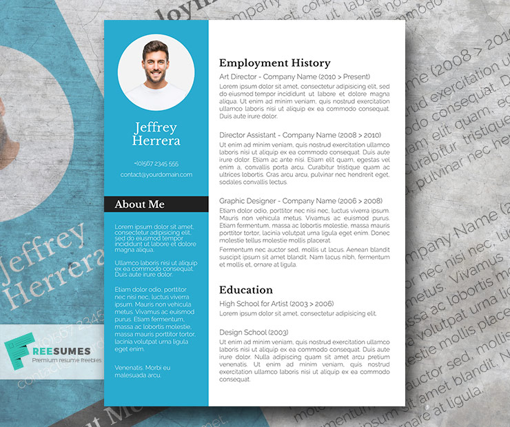
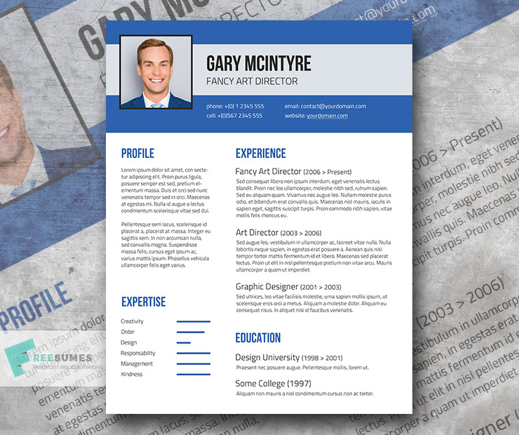
Blue
The color blue inspires trust. That’s why so many corporations use various shades of blue for their brand identity — Lowe’s, Phillips, Pepsi, Oral-B. Blue is also the color of choice in industries like:
- Law enforcement
- Computer and data security
- Military and defense
- Legal
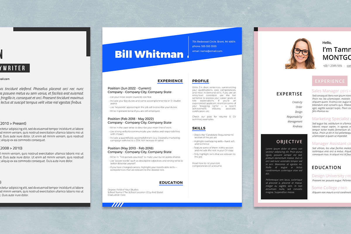
Apart from instilling confidence, blue also has a comforting effect on people. If you want to add a splash of bring to your resume but maintain a high level of professionalism, blue is an ideal hue.
Recommended Blue Resume Templates
Gray
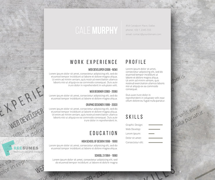
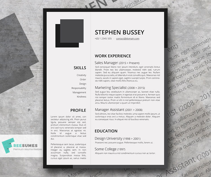
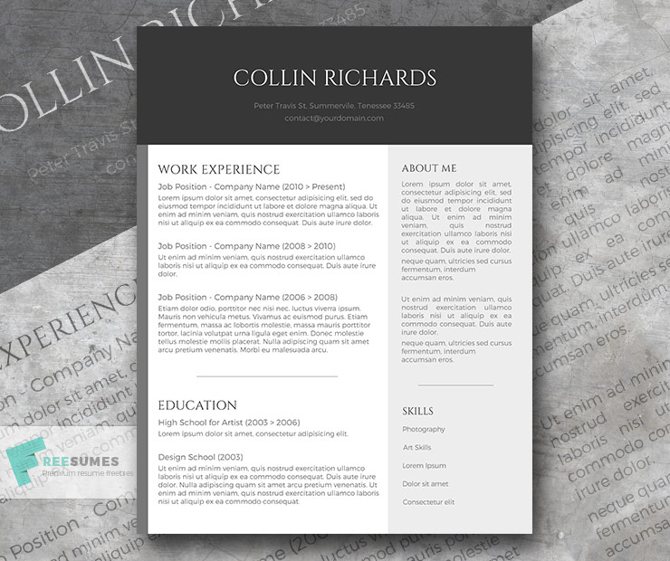
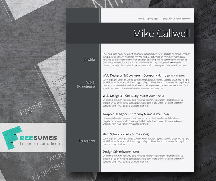
Gray is the new black. Think of occasions in which you would choose the color black to make a sleek impression. You can easily substitute it with various tints of grey to achieve the same goal.
For your resume, gray is truly a back-to-basic color. Use a few different shades to accentuate the header area or make your sidebar pop. Gray resume designs look modern and appropriate for traditional industries, especially if you prefer a minimalistic resume look.
Recommended Gray Resume Templates
Yellow
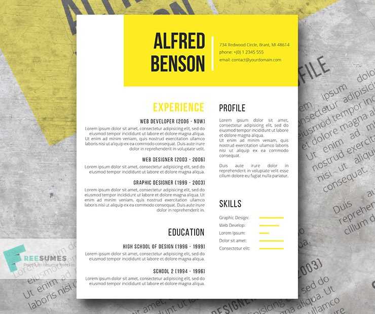
Yellow is a high-energy color. It makes people happy and optimistic (quite the right mood for a hiring manager, right?).
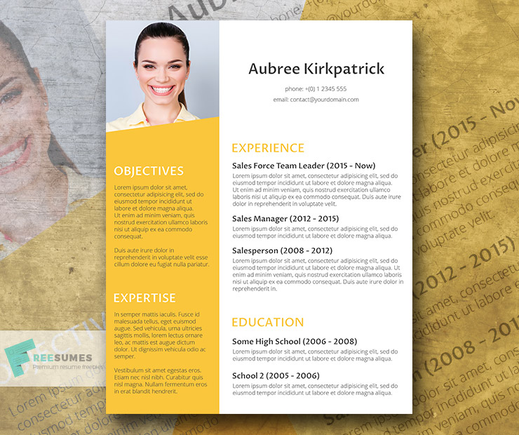
For resume design, yellow is a great accent color to liven up a black-and-white or gray resume. You can use it to highlight different resume sections, the sidebar, or the header area. If you’re in the creative industry, you can go even bolder and use a bright yellow color for the resume background.
Recommended Yellow Resume Templates
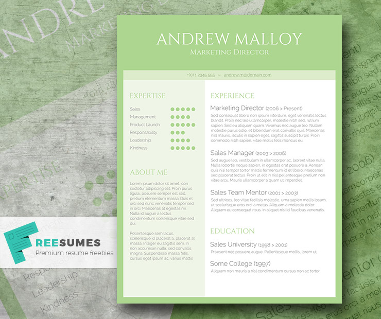
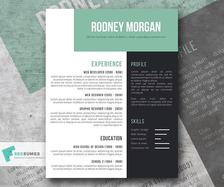
Green
Green brings on feelings of hope, wealth, and optimism. It’s also associated with nature and the environment. So it’s easy to picture why companies love using it for branding and marketing. Starbucks, Whole Foods, Cargill, and Land Rover are among its fans.
The darker shades of green and jewel tones can be used similarly to blue as a way to design a modern resume with nods toward traditionalism.
Recommended Green Resume Templates
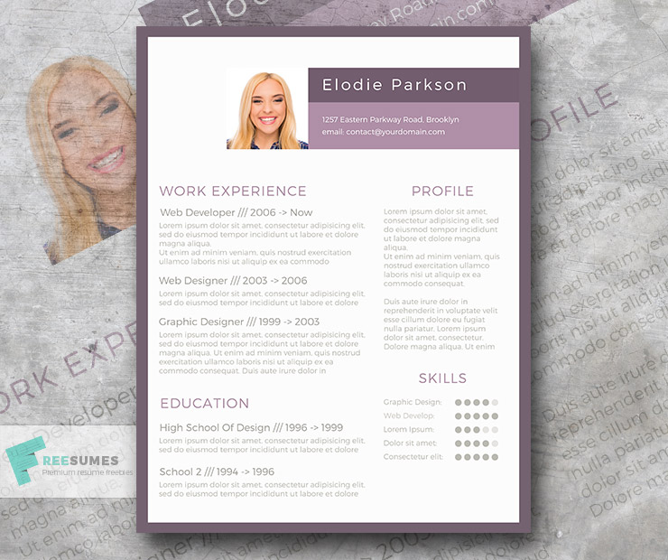
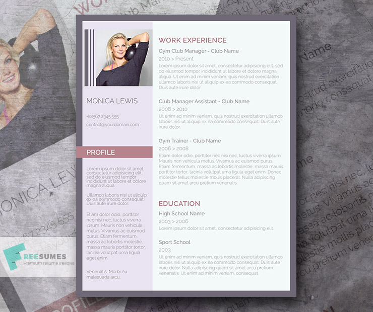
Mauve
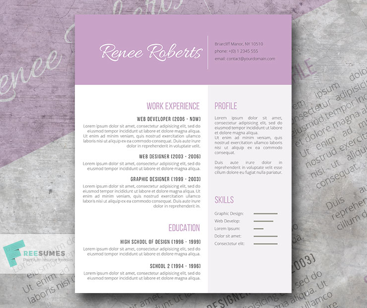
Mauve is a creative color choice for a resume, but it surely is one people will remember!
This hue in the purple family evokes femininity, creativity, and joy. People also associate it with springtime and renewal.
Used correctly, mauve can help your resume stand out amongst other applicants by showing your bolder personality and creative flair.
Recommended Mauve Resume Templates
Pink
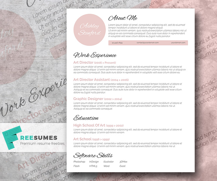
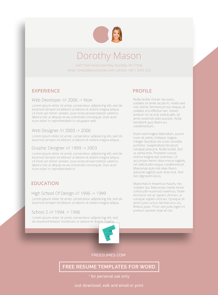
Pink is an interesting choice for a resume. It is often associated with nurturing and caregiving. Some see it as a pure and innocent color. On the other hand, a hot pink is bold and contemporary.
People who work in the hospitality industry can use pink in their resumes to appear more compassionate. Artists, designers, and other creative types can use brighter, darker pinks to stand out and show some personality.
Recommended Pink Resume Templates
What Colors Work Best Together For a Resume?
Your resume doesn’t have to be in black ink on a white background. Although, that is a classic combo. Experiment with several color schemes for your resume to see what gets the best response.
The top three mark-hitting color combinations for a resume are:
- Black, white, and gray
- Tonal pink shades with black
- Blue and White
Black, White, and Gray
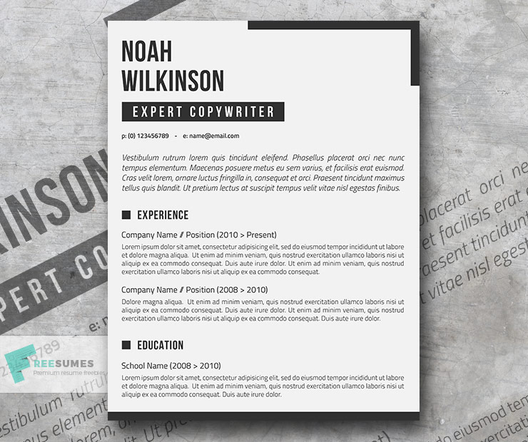
Minimalism is in, and that means resumes too. You can always go right with this palette. You can even shake things up a bit. For example, try a very light gray background instead of white. You might also use a bold, black font for your headings but a few different hues of gray for your bullet points and subheadings.
If you print your resume, elevate this combination even further. Invest in high-quality paper stock and envelopes to make an exquisite first impression.
Recommended Resume Templates
Tonal Pink Shades With Black
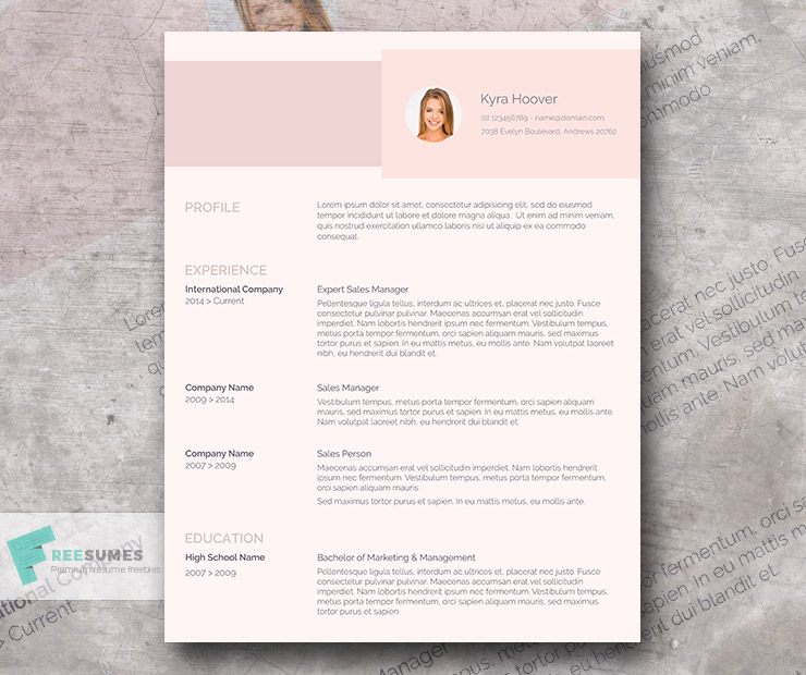
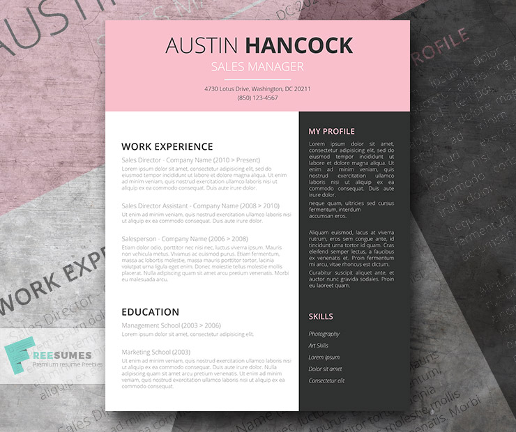
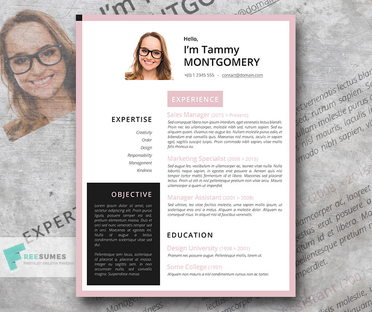
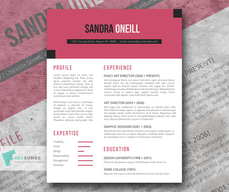
Tonal pink shades are more muted than classic hues. These combine beautifully with black as the accent color for a resume font.
Resume designs in his color scheme look fresh, stunning, and professional. So give it a try for a change!
Recommended Resume Templates
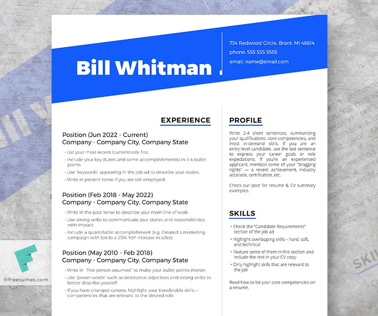
Blue, Black, and White
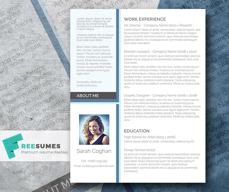
Blue, black, and white is another classic color combination for a resume. It communicates professionalism and confidence. Use this when you want to cast an impression of a capable, reliable, and authoritative candidate.
Recommended Resume Templates
Final Thoughts: Choosing The Right Resume Colors
People make two types of mistakes when choosing colors for a resume.
The first is assuming you are stuck with a basic black-and-white resume. It’s an okay combination, but not the only option you have. Bring in some more gloss.
The second is choosing colors based on personal preferences. Your favorite outfit may be sweatpants, but you wouldn’t wear those to a job interview. Likewise, some color combinations are great fun, but they don’t belong on any resume.
Use color psychology to inform your choice. Even better, heed the advice of professional resume designers and go with one of our best resume template designs.
The post 6 Best Colors For Your Resume (According to Pro Designers) appeared first on Freesumes.com.
